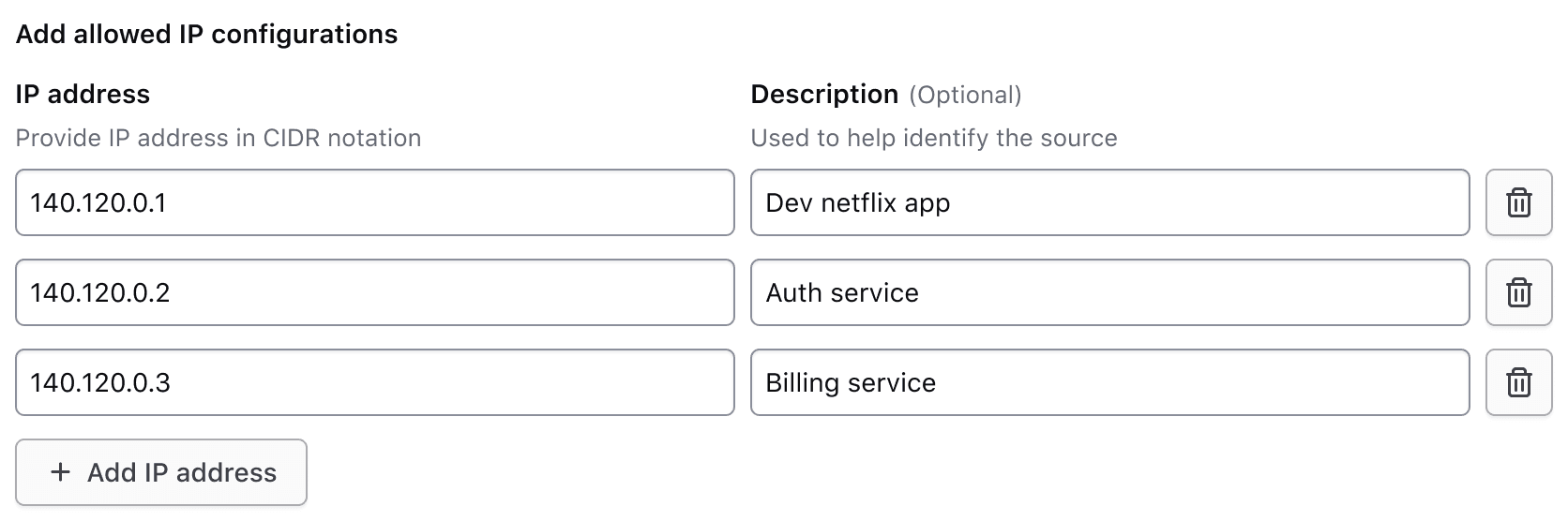
Usage
When to use
- When two related inputs (often a key and value) are repeated for batch submission.
- When collective validation of each associated row is required.
When not to use
- When inputs in each row are not closely related, use the form layout helpers instead.
Header
The header for the Key Value Inputs includes a legend, helper text, and a generic content slot.
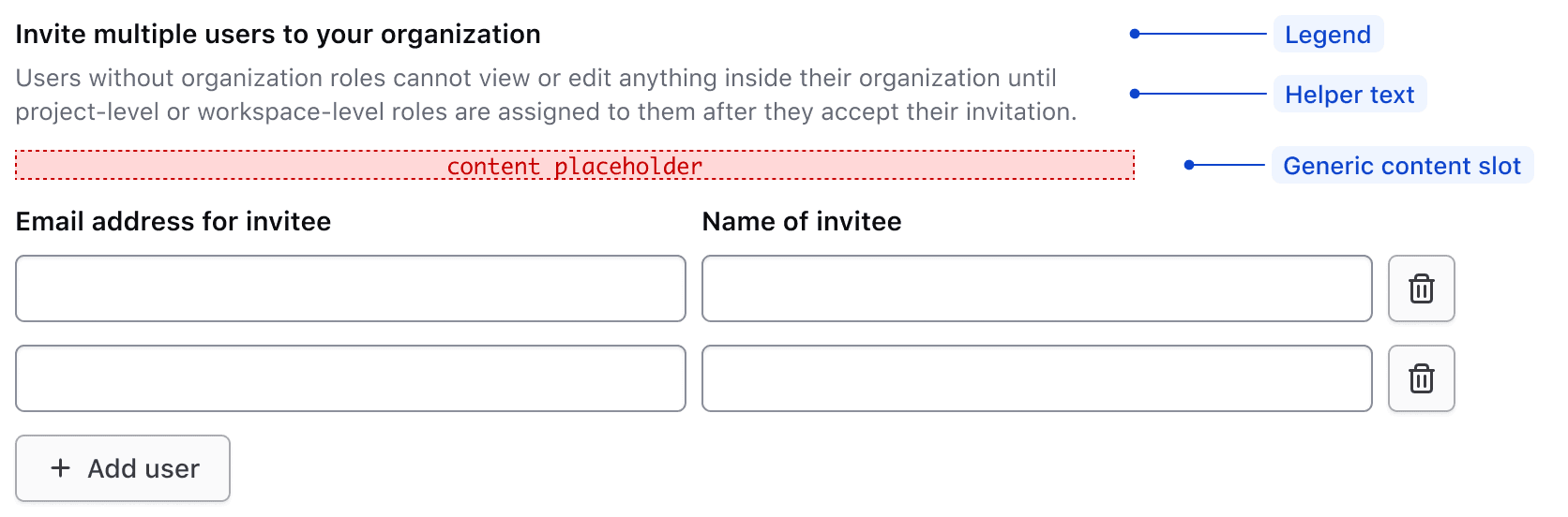
Legend
A legend is required to provide context for the overall fieldset.
Regardless of whether the Key Value Inputs component is placed together with other form components, or used on its own, a legend is always mandatory.
With other elements
The legend's usage with other form elements present.
Alone in form
The legend's usage when the Key Value Inputs are the only form element on the page.
Helper text and generic content
The optional helper text and generic content slot can be used to provide additional information that applies to all rows.
Use the helper text and generic content slot to reduce the amount of repeated information in each row. This focuses the user’s attention on data submission.
Don’t repeat information in each row if it can be explained once at the top of the rows.
Input rows
Each row typically includes two inputs, one for a key and one for a value. However, there may be exceptions where a single input may be necessary.
Input types
The Key Value Inputs component can contain various types of form elements, but there are some common patterns that represent the majority of HashiCorp use cases.
For the key input, this includes:
- Text Input
- Select
For the value input, this includes:
- Text Input
- File Input
- SuperSelect
- Masked Input
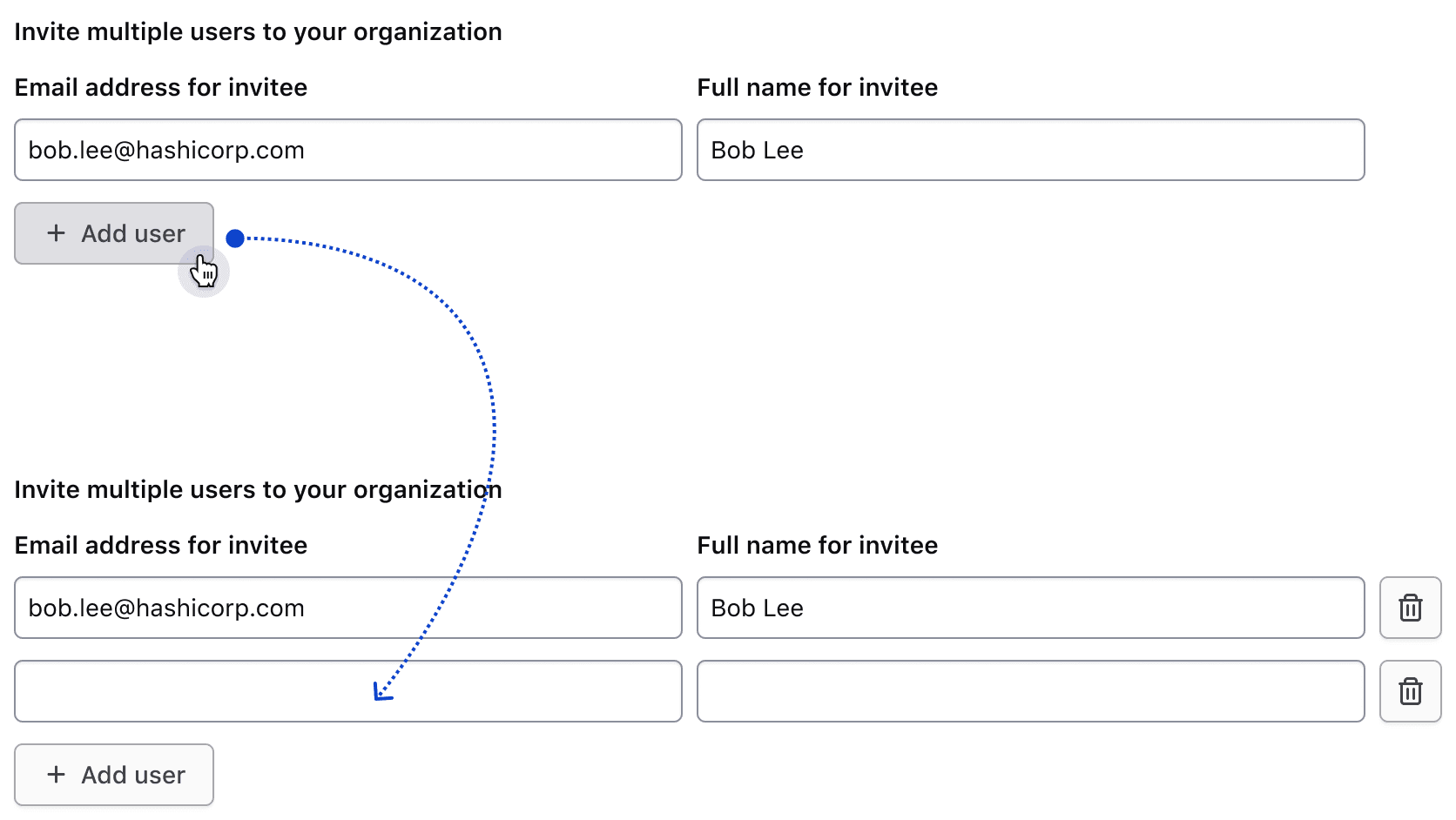
Adding rows
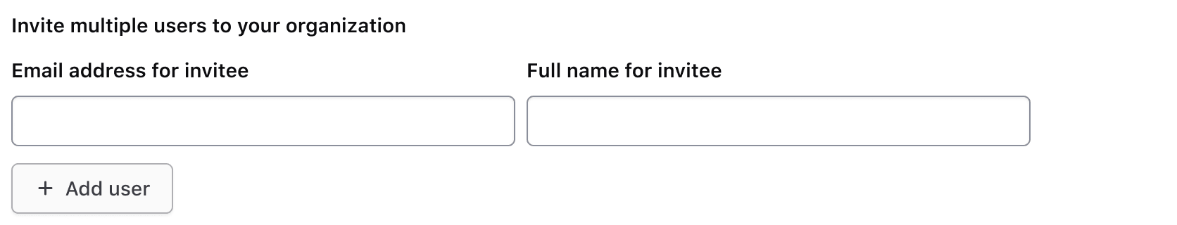
Users can add rows to the set of existing rows via the add button.
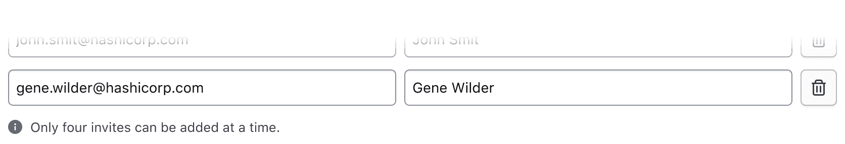
Hitting a row limit
If there is a row limit and the user reaches it, the add button should be replaced with an inline alert notifying them of the limit.
If the maximum number of rows has been reached and the user deletes a row, the alert should be replaced with the add button.
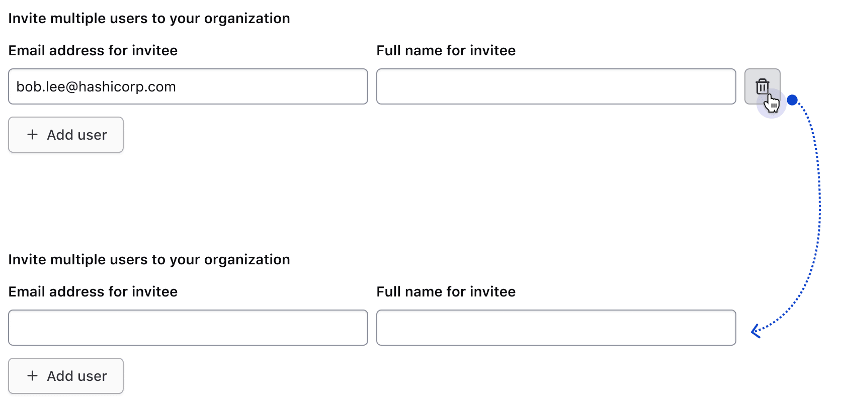
Delete behavior
The interactions in this section are intended to be implemented by the consumer. At least one row should remain visible at all times.
Single row behavior
If the row's inputs are empty, the delete button will be hidden.
Once content is entered in either of the two inputs, the delete button will become visible. Clicking it will remove the row's data and hide the button.
More than one row behavior
If more than one row is present, users can opt to delete any of the rows.
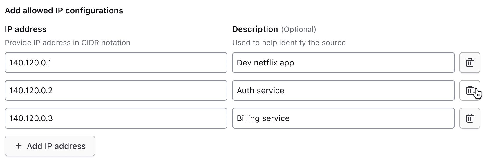
Footer
The footer includes an add button, compact alert, or fieldset validation.
Add button
The add button is displayed by default and, when clicked, appends a new row to collect additional information. The labeling of this button follows our content guidelines, e.g., "Add {object}."

Maximum number of rows reached
Use a compact alert to notify the user when they've reached a maximum number of rows. While the content can be customized, we recommend using the following message: "Only {maximum number} {objects} can be added at a time."
This uses the compact neutral Alert to avoid visually competing with other high-priority feedback, such as input errors.

Validation
If a specific error is associated with the fieldset, it will be displayed below the add button.
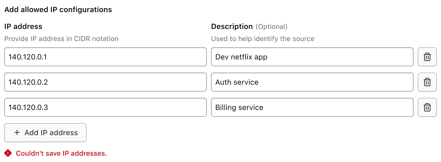
For additional information on form validation, read more about this in our form patterns validation documentation.
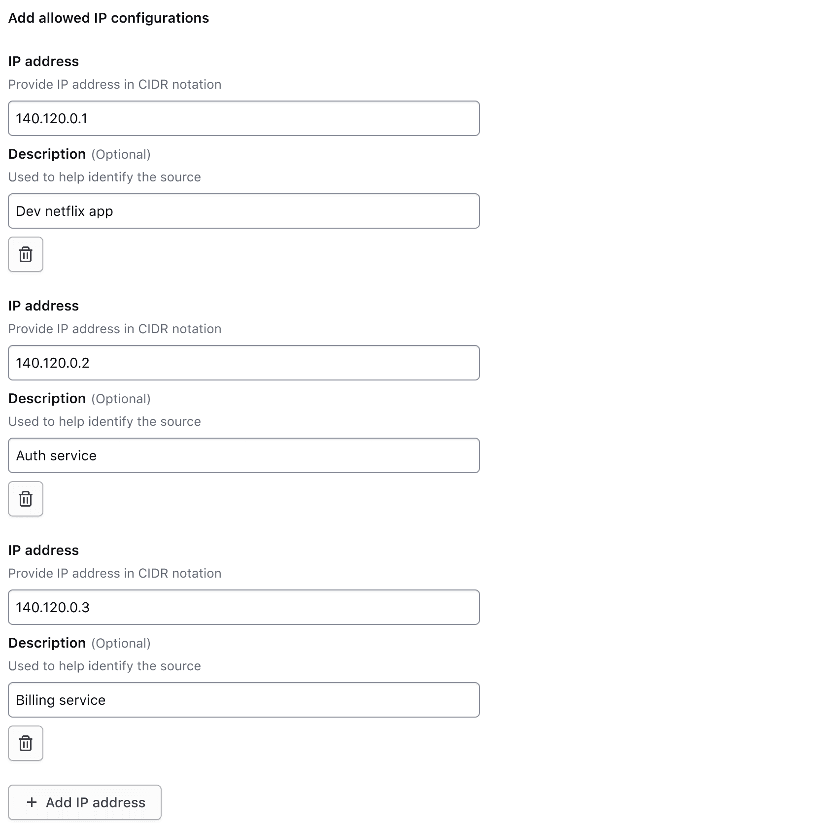
Responsive behavior
Medium and above
In viewport sizes that are greater than or equal to the medium (md) breakpoint, the label and helper text are only visible for the first row of inputs. This reduces visual clutter by condensing the form elements.
Less than medium
When the viewport is less than the medium (md) breakpoint, all field elements stack to occupy 100% of the container width and display the label and helper text for their associated inputs. As the form height increases, the visible labels and helper text orient the user as they scroll down and fill in information. If repeating each input’s helper text isn’t useful to the user, consider placing that information in the fieldset helper text instead to reduce the visual noise.
How to use this component
The basic invocation of the Key Value Inputs requires the @data argument. This is used as the initial data to create the rows of inputs.
Each input is associated with a field, that contains a label; the input; and an optional indicator, helper text, and error message.
Required vs. optional
Use the @isRequired and @isOptional arguments to add a visual indicator that the entire Key Value Inputs is required or optional.
<!--  Note: this is a non-interactive example -->

<Hds::Form::KeyValueInputs
  @isRequired={{true}}
  @data={{array (hash email="j.maxene@randatmail.com" name="Judith Maxene")}}
>
  <:header as |H|>
    <H.Legend>Invite multiple users to your organization</H.Legend>
  </:header>
  <:row as |R|>
    <R.Field as |F|>
      <F.Label>
        Email address for invitee
      </F.Label>
      <F.TextInput @value={{R.rowData.email}} />
    </R.Field>
    <R.Field as |F|>
      <F.Label>
        Name of invitee
      </F.Label>
      <F.TextInput @value={{R.rowData.name}} />
    </R.Field>
    <R.DeleteRowButton />
  </:row>
</Hds::Form::KeyValueInputs>
<hr class="doc-code-group-hr" />
<Hds::Form::KeyValueInputs
  @isOptional={{true}}
  @data={{array (hash email="j.maxene@randatmail.com" name="Judith Maxene")}}
>
  <:header as |H|>
    <H.Legend>Invite multiple users to your organization</H.Legend>
  </:header>
  <:row as |R|>
    <R.Field as |F|>
      <F.Label>
        Email address for invitee
      </F.Label>
      <F.TextInput @value={{R.rowData.email}} />
    </R.Field>
    <R.Field as |F|>
      <F.Label>
        Name of invitee
      </F.Label>
      <F.TextInput @value={{R.rowData.name}} />
    </R.Field>
    <R.DeleteRowButton />
  </:row>
</Hds::Form::KeyValueInputs>
To add the visual indicator to a specific field, use the @isRequired/@isOptional argument directly on the field itself.
<!--  Note: this is a non-interactive example -->

<Hds::Form::KeyValueInputs @data={{array (hash email="j.maxene@randatmail.com" name="")}}>
  <:header as |H|>
    <H.Legend>Invite multiple users to your organization</H.Legend>
  </:header>
  <:row as |R|>
    <R.Field @isRequired={{true}} as |F|>
      <F.Label>
        Email address for invitee
      </F.Label>
      <F.TextInput @value={{R.rowData.email}} />
    </R.Field>
    <R.Field @isOptional={{true}} as |F|>
      <F.Label>
        Name of invitee
      </F.Label>
      <F.TextInput @value={{R.rowData.name}} />
    </R.Field>
    <R.DeleteRowButton />
  </:row>
</Hds::Form::KeyValueInputs>
Validation
The Key Value Inputs can be validated at the fieldset level or on each individual field. You can choose which level is appropriate depending on the use case, but it is best practice to make any error message as specific as possible. Avoid putting the error on the fieldset if the issue occurs on a single field.
To display an error for the entire fieldset (the whole group of inputs), use the [F].Error component yielded by the :footer named block.
<!--  Note: this is a non-interactive example -->

<Hds::Form::KeyValueInputs @data={{array (hash email="j.maxene@randatmail.com" name="Judith Maxene")}}>
  <:header as |H|>
    <H.Legend>Invite multiple users to your organization</H.Legend>
    <H.HelperText>
      Users without an organization role cannot view or edit anything inside their organization until a project-level or
      workspace-level role is assigned to them after they accept their invitation.
    </H.HelperText>
  </:header>
  <:row as |R|>
    <R.Field as |F|>
      <F.Label>
        Email address for invitee
      </F.Label>
      <F.TextInput @value={{R.rowData.email}} />
    </R.Field>
    <R.Field as |F|>
      <F.Label>
        Name of invitee
      </F.Label>
      <F.TextInput @value={{R.rowData.name}} />
    </R.Field>
    <R.DeleteRowButton />
  </:row>
  <:footer as |F|>
    <F.AddRowButton @text="Add user" />
    <F.Error>Unable to invite users.</F.Error>
  </:footer>
</Hds::Form::KeyValueInputs>
To display an error on a single field, set the isInvalid argument on the [R].Field yielded component, and use the [F].Error yielded component.
<!--  Note: this is a non-interactive example -->

<Hds::Form::KeyValueInputs @data={{array (hash email="" name="Judith Maxene")}}>
  <:header as |H|>
    <H.Legend>Invite multiple users to your organization</H.Legend>
    <H.HelperText>
      Users without organization roles cannot view or edit anything inside their organization until project-level or
      workspace-level roles are assigned to them after they accept their invitation.
    </H.HelperText>
  </:header>
  <:row as |R|>
    <R.Field @isRequired={{true}} @isInvalid={{true}} as |F|>
      <F.Label>
        Email address for invitee
      </F.Label>
      <F.TextInput @value={{R.rowData.email}} />
      <F.Error>Email is required.</F.Error>
    </R.Field>
    <R.Field as |F|>
      <F.Label>
        Name of invitee
      </F.Label>
      <F.TextInput @value={{R.rowData.name}} />
    </R.Field>
    <R.DeleteRowButton />
  </:row>
  <:footer as |F|>
    <F.AddRowButton @text="Add user" />
  </:footer>
</Hds::Form::KeyValueInputs>
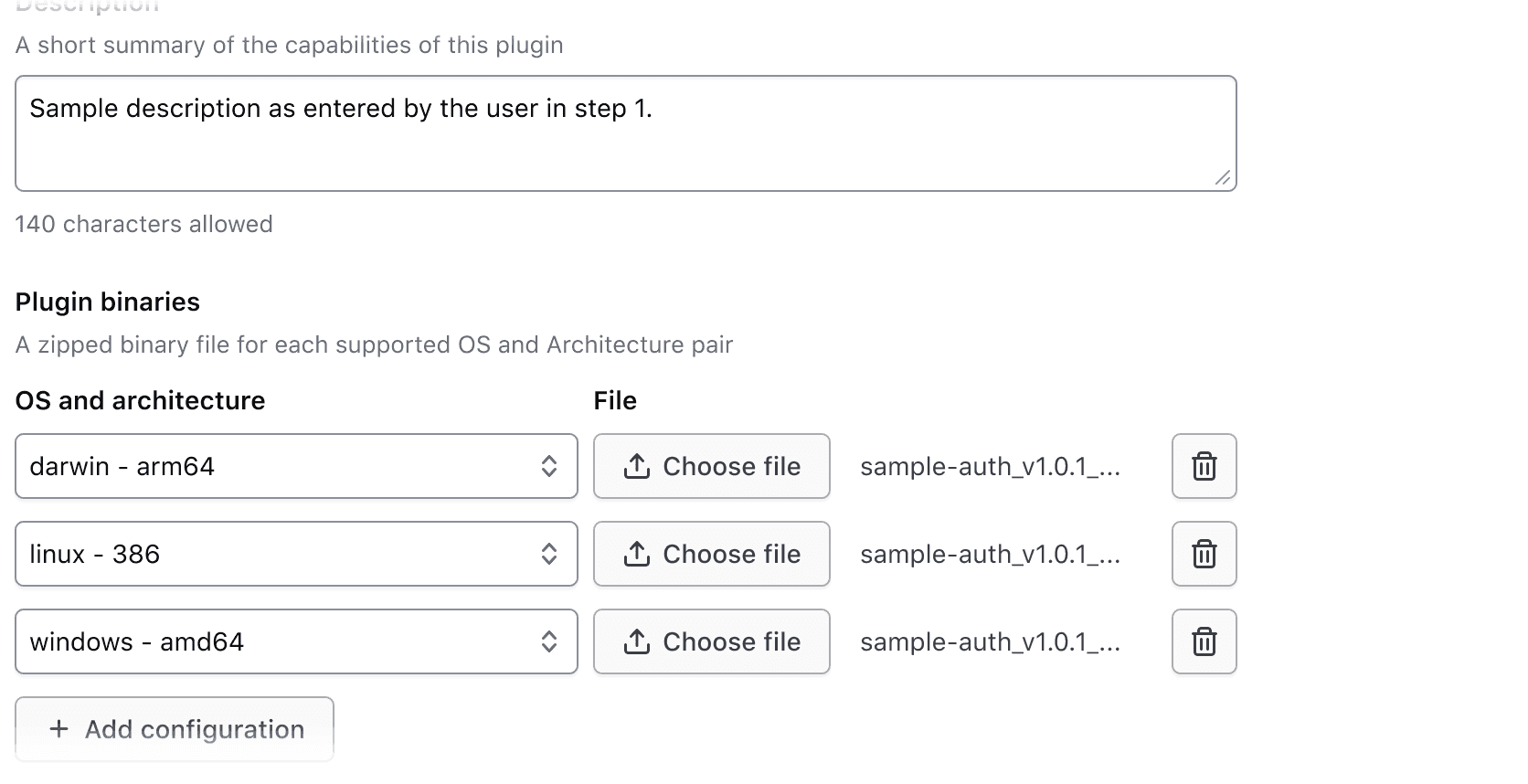
Input types
The Form::KeyValueInputs::Field component yields File Input, Masked Input, Select, SuperSelect::Single, SuperSelect::Multiple, TextInput, and Textarea inputs.
<!--  Note: this is a non-interactive example -->

<Hds::Form::KeyValueInputs @data={{array (hash os="darwin") (hash os="linux") (hash os="windows")}}>
  <:header as |H|>
    <H.Legend>Plugin binaries</H.Legend>
    <H.HelperText>
      A zipped binary file for each supported OS and architecture pair.
    </H.HelperText>
  </:header>
  <:row as |R|>
    <R.Field as |F|>
      <F.Label>
        OS and architecture
      </F.Label>
      <F.Select>
        <option>darwin - arm64</option>
        <option selected={{if (eq R.rowData.os "darwin") true}}>darwin - arm64</option>
        <option selected={{if (eq R.rowData.os "linux") true}}>linux - 386</option>
        <option selected={{if (eq R.rowData.os "windows") true}}>windows - amd64</option>
      </F.Select>
    </R.Field>
    <R.Field as |F|>
      <F.Label>
        File
      </F.Label>
      <F.FileInput />
    </R.Field>
    <R.DeleteRowButton />
  </:row>
  <:footer as |F|>
    <F.AddRowButton @text="Add configuration" />
  </:footer>
</Hds::Form::KeyValueInputs>
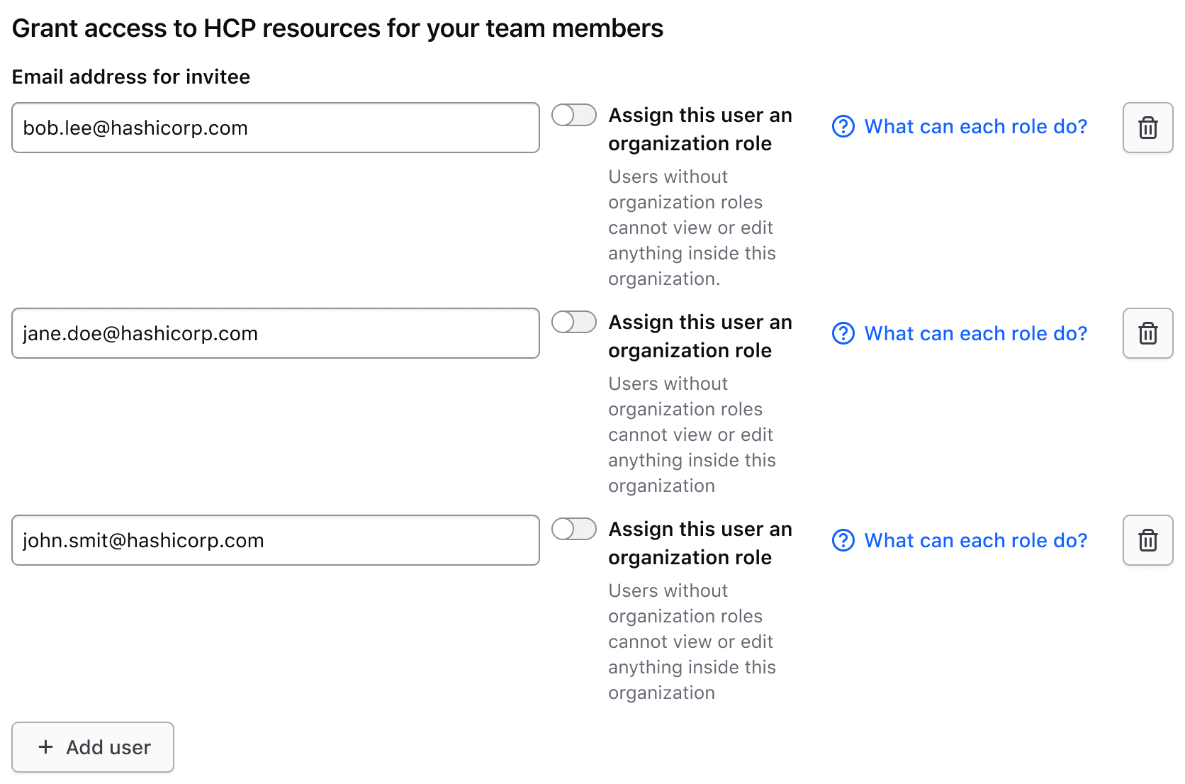
Generic content
If there is additional content needed in the header or a need for an unsupported input type, there are generic slots available.
<!--  Note: this is a non-interactive example -->

<Hds::Form::KeyValueInputs
  @data={{array
    (hash email="j.maxene@randatmail.com" hasOrgRole=true)
    (hash email="e.aishah@randatmail.com" hasOrgRole=false)
  }}
>
  <:header as |H|>
    <H.Legend>Grant access to HCP resources for your team members</H.Legend>
    <H.HelperText>
      Users without an organization role cannot view or edit anything inside their organization until a project-level or
      workspace-level role is assigned to them after they accept their invitation.
    </H.HelperText>
    <H.Generic>
      <Hds::Button @color="tertiary" @text="What can each role do?" @icon="help" />
    </H.Generic>
  </:header>
  <:row as |R|>
    <R.Field as |F|>
      <F.Label>
        Email address for invitee
      </F.Label>
      <F.TextInput @value={{R.rowData.email}} />
    </R.Field>
    <R.Generic>
      <Hds::Form::Toggle::Field checked={{R.rowData.hasOrgRole}} as |T|>
        <T.Label>Assign this user an organization role</T.Label>
      </Hds::Form::Toggle::Field>
    </R.Generic>
    <R.DeleteRowButton />
  </:row>
  <:footer as |F|>
    <F.AddRowButton @text="Add user" />
  </:footer>
</Hds::Form::KeyValueInputs>
Field width
Fields are equal width by default. Use the Field’s width argument to customize field widths.
<!--  Note: this is a non-interactive example -->

<Hds::Form::KeyValueInputs
  @data={{array
    (hash tag="production" description="This is a tag meant to indicate production environments.")
    (hash tag="staging" description="")
  }}
>
  <:header as |H|>
    <H.Legend>Custom tags</H.Legend>
  </:header>
  <:row as |R|>
    <R.Field as |F|>
      <F.Label>
        Name
      </F.Label>
      <F.TextInput @value={{R.rowData.tag}} />
    </R.Field>
    <R.Field @width="2fr" as |F|>
      <F.Label>
        Description
      </F.Label>
      <F.Textarea @value={{R.rowData.description}} />
    </R.Field>
    <R.DeleteRowButton />
  </:row>
  <:footer as |F|>
    <F.AddRowButton @text="Add tag" />
  </:footer>
</Hds::Form::KeyValueInputs>
Component interaction
Below we showcase a couple of examples of common patterns. They should be used as starting point, and adapted to the actual context and needs.
Updating the rows
Consumers are responsible for handling the logic to add or remove a row. To do this, use the onClick argument to pass a callback function on the yielded [F].AddRowButton in the :footer named block or the yielded [R].DeleteRowButton in the :row named block.
<Hds::Form::KeyValueInputs @data={{this.exampleData}}>
  <:header as |H|>
    <H.Legend>Invite multiple users to your organization</H.Legend>
    <H.HelperText>
      Users without an organization role cannot view or edit anything inside their organization until a project-level or
      workspace-level role is assigned to them after they accept their invitation.
    </H.HelperText>
  </:header>
  <:row as |R|>
    <R.Field as |F|>
      <F.Label>
        Email address for invitee
      </F.Label>
      <F.TextInput @value={{R.rowData.email}} />
    </R.Field>
    <R.Field as |F|>
      <F.Label>
        Name of invitee
      </F.Label>
      <F.TextInput @value={{R.rowData.name}} />
    </R.Field>
    {{#if this.canDeleteRow}}
      <R.DeleteRowButton @onClick={{this.onDeleteRow}} />
    {{/if}}
  </:row>
  <:footer as |F|>
    <F.AddRowButton @text="Add user" @onClick={{this.onAddRow}} />
  </:footer>
</Hds::Form::KeyValueInputs>
Maximum number of rows
Consumers are responsible for implementing the logic for the maximum number of rows a user can add. If they have reached the maximum number of rows, you can use the yielded Alert in the :footer named block to notify them, and remove the yielded [F].AddRowButton.
<Hds::Form::KeyValueInputs @data={{this.exampleData}}>
<:header as |H|>
<H.Legend>Plugin binaries</H.Legend>
<H.HelperText>
A zipped binary file for each supported OS and architecture pair.
</H.HelperText>
</:header>
<:row as |R|>
<R.Field as |F|>
<F.Label>
OS and architecture
</F.Label>
<F.Select>
<option></option>
<option selected={{if (eq R.rowData.os "darwin") true}}>darwin - arm64</option>
<option selected={{if (eq R.rowData.os "linux") true}}>linux - 386</option>
<option selected={{if (eq R.rowData.os "windows") true}}>windows - amd64</option>
</F.Select>
</R.Field>
<R.Field as |F|>
<F.Label>
File
</F.Label>
<F.FileInput />
</R.Field>
{{#if this.canDeleteRow}}
<R.DeleteRowButton @onClick={{this.onDeleteRow}} />
{{/if}}
</:row>
<:footer as |F|>
{{#if (lt this.exampleData.length 3)}}
<F.AddRowButton @text="Add OS & Architecture" @onClick={{this.onAddRow}} />
{{else}}
<F.Alert as |A|>
<A.Description>Only 3 binaries can be added at a time.</A.Description>
</F.Alert>
{{/if}}
</:footer>
</Hds::Form::KeyValueInputs>
Component API
Form::KeyValueInputs
data
array
<:header>
named block
[H].Legend
yielded component
<legend> element. The content can be a simple string or a more complex/structured string, in which case it inherits the text style. For details about its API, check the Form::Legend component.
The
id attribute of the element is automatically generated.
[H].HelperText
yielded component
Form::HelperText component.
The
id attribute of the element is automatically generated.
[H].Generic
yielded component
<:row>
named block
[R].Field
yielded component
Form::KeyValueInputs::Field yielded as contextual component (see below).
[R].Generic
yielded component
Form::KeyValueInputs::Generic yielded as contextual component (see below).
[R].DeleteRowButton
yielded component
Form::KeyValueInputs::DeleteRowButton yielded as contextual component (see below).
[R].rowData
unknown
@each loop.
[R].rowIndex
number
@each loop.
<:footer>
named block
[F].Alert
yielded component
Form::Alert yielded as contextual component. For details about its API, check the Form::Legend component.
It is automatically set to
compact and neutral.
[F].AddButton
yielded component
Form::KeyValueInputs::AddButton yielded as contextual component (see below).
[F].Error
yielded component
Form::Error yielded as contextual component. The content can be a simple string or a more complex/structured string, in which case it inherits the text style. For details about its API, check the Form::Error component.
The
id attribute of the element is automatically generated.
isRequired
boolean
- false (default)
Required indicator next to the fieldset's legend when user input is required.
isOptional
boolean
- false (default)
Optional indicator next to the fieldset's legend when user input is optional.
extraAriaDescribedBy
string
aria-describedby HTML attribute.
By default, the
aria-describedby attribute is automatically generated by the component, using the IDs of the helper text and errors (if present). Use this argument to pass an extra ID.
…attributes
...attributes.
The attributes will be applied to the
<fieldset> element. This means you can use all the standard HTML attributes of the <fieldset> element and all the usual Ember techniques for event handling, validation, etc.
Examples of HTML attributes:
id, name, disabled. See the whole list of HTML attributes. Examples of Ember modifiers: {{on "input" [do something]}}, {{on "change" [do something]}}, {{on "blur" [do something]}}.
Contextual components
[R].Field
The Form::KeyValueInputs::Field component, yielded as contextual component, in the :row named block.
[F].Label
yielded component
Form::Label component, yielded as a contextual component. For details about its API, check the Form::Label component.
[F].HelperText
yielded component
Form::HelperText component, yielded as a contextual component. For details about its API, check the Form::HelperText component.
[F].FileInput
yielded component
Form::FileInput::Base component, yielded as a contextual component. For details about its API, check the Form::FileInput::Base component.
[F].MaskedInput
yielded component
Form::MaskedInput::Base component, yielded as a contextual component. For details about its API, check the Form::MaskedInput::Base component.
[F].Select
yielded component
Form::Select::Base component, yielded as a contextual component. For details about its API, check the Form::Select::Base component.
[F].SuperSelectSingle
yielded component
Form::SuperSelect::Single::Base component, yielded as a contextual component. For details about its API, check the Form::SuperSelect::Single::Base component.
[F].SuperSelectMultiple
yielded component
Form::SuperSelect::Multiple::Base component, yielded as a contextual component. For details about its API, check the Form::SuperSelect::Multiple::Base component.
[F].TextInput
yielded component
Form::TextInput::Base component, yielded as a contextual component. For details about its API, check the Form::TextInput::Base component.
[F].Textarea
yielded component
Form::Textarea::Base component, yielded as a contextual component. For details about its API, check the Form::Textarea::Base component.
[F].Error
yielded component
Form::Error component, yielded as a contextual component. For details about its API, check the Form::Error component.
id
string
By default, the ID is automatically generated by the component. Use this argument to pass a custom ID.
isRequired
boolean
Required indicator next to the label text when user input is required for the field.
isOptional
boolean
Optional indicator next to the label text when user input is optional for the field.
isInvalid
boolean
width
string
- 1f (default)
1fr of the CSS grid container.
extraAriaDescribedBy
string
aria-describedby HTML attribute.
By default, the
aria-describedby attribute is automatically generated by the component, using the IDs of the helper text and errors (if present). Use this argument to pass an extra ID.
…attributes
...attributes.
[R].Generic
The Form::KeyValueInputs::Generic component, yielded as contextual component in the :row named block.
yield
<div> element.
…attributes
...attributes.
[R].DeleteRowButton
The Form::KeyValueInputs::DeleteRowButton component, yielded as a contextual component in the :row named block. It is built on top of the Button component.
text
string
- Delete row {rowIndex} (default)
onClick
event and the data and index for the associated row.
…attributes
...attributes.
[F].AddRowButton
The Form::KeyValueInputs::AddRowButton component, yielded as a contextual component in the :footer named block. It is built on top of the Button component.
text
string
- Add row (default)
onClick
event.
…attributes
...attributes.
Anatomy
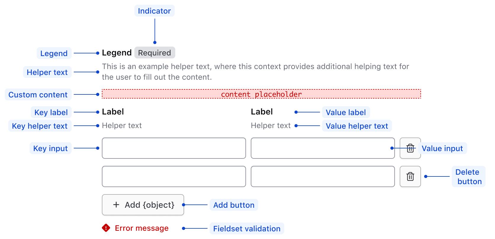
| Element | Usage |
|---|---|
| Legend | Required |
| Indicator | Optional |
| Fieldset helper text | Optional |
| Fieldset generic slot | Optional |
| Key label | Required - if key input visible |
| Key helper text | Optional |
| Key input | Optional |
| Value label | Required - if value input visible |
| Value helper text | Optional |
| Value input | Optional |
| Delete row button | Optional |
| Footer | Either has add button or compact alert in addition to fieldset validation |
Conformance rating
To be conformant, a Legend must be included in the :header named block identifying the purpose of the input groups.
Applicable WCAG Success Criteria
This section is for reference only. This component intends to conform to the following WCAG Success Criteria:
-
1.3.1
Info and Relationships (Level A):
Information, structure, and relationships conveyed through presentation can be programmatically determined or are available in text. -
1.3.2
Meaningful Sequence (Level A):
When the sequence in which content is presented affects its meaning, a correct reading sequence can be programmatically determined. -
1.3.4
Orientation (Level AA):
Content does not restrict its view and operation to a single display orientation, such as portrait or landscape. -
1.3.5
Identify Input Purpose (Level AA):
The purpose of each input field collecting information about the user can be programmatically determined when the input field serves a purpose identified in the Input Purposes for User Interface Components section; and the content is implemented using technologies with support for identifying the expected meaning for form input data. -
1.4.1
Use of Color (Level A):
Color is not used as the only visual means of conveying information, indicating an action, prompting a response, or distinguishing a visual element. -
1.4.10
Reflow (Level AA):
Content can be presented without loss of information or functionality, and without requiring scrolling in two dimensions. -
1.4.11
Non-text Contrast (Level AA):
The visual presentation of the following have a contrast ratio of at least 3:1 against adjacent color(s): user interface components; graphical objects. -
1.4.12
Text Spacing (Level AA):
No loss of content or functionality occurs by setting all of the following and by changing no other style property: line height set to 1.5; spacing following paragraphs set to at least 2x the font size; letter-spacing set at least 0.12x of the font size, word spacing set to at least 0.16 times the font size. -
1.4.3
Minimum Contrast (Level AA):
The visual presentation of text and images of text has a contrast ratio of at least 4.5:1 -
1.4.4
Resize Text (Level AA):
Except for captions and images of text, text can be resized without assistive technology up to 200 percent without loss of content or functionality. -
2.1.1
Keyboard (Level A):
All functionality of the content is operable through a keyboard interface. -
2.1.2
No Keyboard Trap (Level A):
If keyboard focus can be moved to a component of the page using a keyboard interface, then focus can be moved away from that component using only a keyboard interface. -
2.4.6
Headings and Labels (Level AA):
Headings and labels describe topic or purpose. -
2.4.7
Focus Visible (Level AA):
Any keyboard operable user interface has a mode of operation where the keyboard focus indicator is visible. -
3.2.1
On Focus (Level A):
When any user interface component receives focus, it does not initiate a change of context. -
3.2.2
On Input (Level A):
Changing the setting of any user interface component does not automatically cause a change of context unless the user has been advised of the behavior before using the component. -
3.2.4
Consistent Identification (Level AA):
Components that have the same functionality within a set of Web pages are identified consistently. -
3.3.1
Error Identification (Level A):
If an input error is automatically detected, the item that is in error is identified and the error is described to the user in text. -
3.3.2
Labels or Instructions (Level A):
Labels or instructions are provided when content requires user input. -
4.1.2
Name, Role, Value (Level A):
For all user interface components, the name and role can be programmatically determined; states, properties, and values that can be set by the user can be programmatically set; and notification of changes to these items is available to user agents, including assistive technologies.
Support
If any accessibility issues have been found within this component, let us know by submitting an issue.
6.2.0
Translated strings for DeleteRowButton and Field screen reader text.
6.1.1
Translated strings for the KeyValueInputs AddRowButton ariaLabel and description text.
6.1.0
Converted component to gts format.
4.24.0
Update the data and returned R.rowData to use generic types, so the type of the data is retained.
4.21.0
Added component and related sub-components.